Projects List Actions
The Plan section in Odyssey is the place to manage all of your projects across your pipeline.
Navigate to Plan to manage all projects created by your organization.
Shared Projects lists all projects that were created by another organization and shared with you.
There are a number of useful actions you can take on this page, including:
- View your projects on a map
- Copy/delete projects
- Filter, sort, and organize the columns for your list
- Download a portfolio financial model
- Group projects in categories
- Run analytics on Key Performance Indicators
- Take “bulk actions” such as applying assumptions to multiple projects or downloading data from projects

Note: Odyssey has dashboards to visualize many metrics about your projects, with the opportunity to dissect data across different segments of your portfolio. Review the Anlaytics page for this.
Organizing your pipeline
Filter, sort and adjust columns
The projects list can be customized to display data as you would like to see it. You can
filter your list
by typing into the search bar at the top of each column, so that only the relevant projects appear when you navigate to the page. You can also
sort by columns by clicking the arrows next to the column headers.
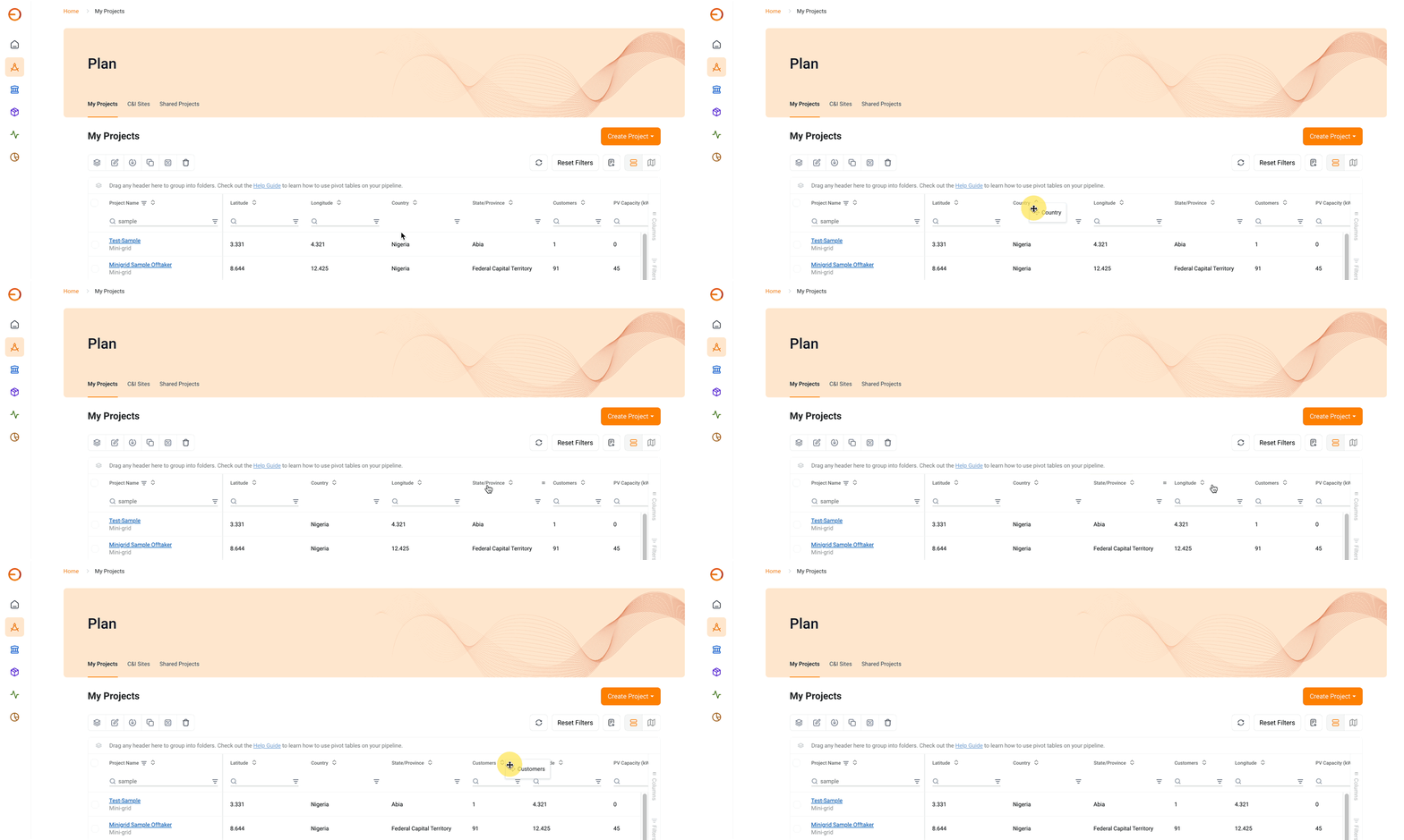
Drag columns to move columns into the order you would like to see them. Clicking on “Columns” on the right side of the table will allow you to select which columns you would like to see in your table.

You can also
group your projects
into different categories, using the columns to set your folders. Simply click on “Columns” to the right of the table, and drag any column to the top of the table. You can also drag it below the list, under “Row Groups”.
In the example below, projects are grouped by the State/Province they are located in.
 You can group projects by the Program column to view projects related to the Program you are participating in.
Analyzing Your Pipeline
You can also run analytics on your pipeline using the
“Pivot mode” function. This allows you to view aggregated data for different groups of projects. For example, you may want to see the total installed PV capacity for a given region, or the average number of customers for your projects in each country.
To run these analytics, click on the word “Column” on the right of the table. Select “Pivot mode” at the top. Select how you would like to group your analytics by dragging a column header below “Row Groups”. Select which data points you would like to analyze by selecting columns headers and dragging them below “Values.” You can then choose which mathematical function to perform for the data (sum, average, etc.)
Related Articles
Projects List Actions
The Projects section in Odyssey is the place to manage all of your projects across your pipeline. Navigate to My Projects to manage all projects created by your organization. Shared Projects lists all projects that were created by another ...Projects List Actions
The Projects section in Odyssey is the place to manage all of your projects across your pipeline. Navigate to My Projects to manage all projects created by your organization. Shared Projects lists all projects that were created by another ...Projects List Actions
The Projects section in Odyssey is the place to manage all of your projects across your pipeline. Navigate to My Projects to manage all projects created by your organization. The Shared Projects section lists all projects that were created by ...Projects List Actions
The Projects section in Odyssey is the place to manage all of your projects across your pipeline. Navigate to My Projects to manage all projects created by your organization. Shared Projects lists all projects that were created by another ...Copy Tender Projects
1. Navigate to the Projects section To see the projects that are available for tendering, navigate to the Projects tab. The projects are grouped by state, press the (+) to see the projects within the state. In Odyssey, you will be able to see the # ...